Junior Visit Day
Welcome! 👋
I’m excited to give you a sense of what we learn in my Introduction to Data Science course.

A PDF of your handouts is available here.
Welcome!
A little about me

- B.S. from Johns Hopkins University
- Majors: Biomedical Engineering, Applied Mathematics and Statistics
- Minor: Computer Science
- PhD in Biostatistics from Johns Hopkins
- I’ve been teaching across the statistics and data science curriculum at Mac since 2018:
- Introductory and intermediate courses in statistics and data science
- Upper level capstone course called Causal Inference (how do we study the effects of policies and interventions?)
- In addition to my teaching, I am an environmental activist.
- Will be starting part time as the Research and Policy Director at the MN Environmental Justice Table in June
- Shows up in my involvement with at Mac with our Sustainability Office
- I am part of a coalition working to shut down a trash incinerator in Minneapolis.
- Data skills have allowed me to acquire, analyze, and visualize data related to air pollution and its health risks
- Hiring 2 students to help me with a research project this summer to examine the incinerator’s impacts in new ways
What do we learn in Introduction to Data Science?
- Principles and technical tools for working with data
- Students gain a lot of experience with the R programming language for data management, exploration, and visualization.
- We spend about 2/3 of the semester on content and the last third on process skills during an intensive project experience.
Data Visualization - Principles
One of the quickest ways to gain insight from data is to display it in visual form.
- Compare groups
- Observe trends
- Notice outliers
However, designing an effective visualization is hard!
We’ll explore this through examples.
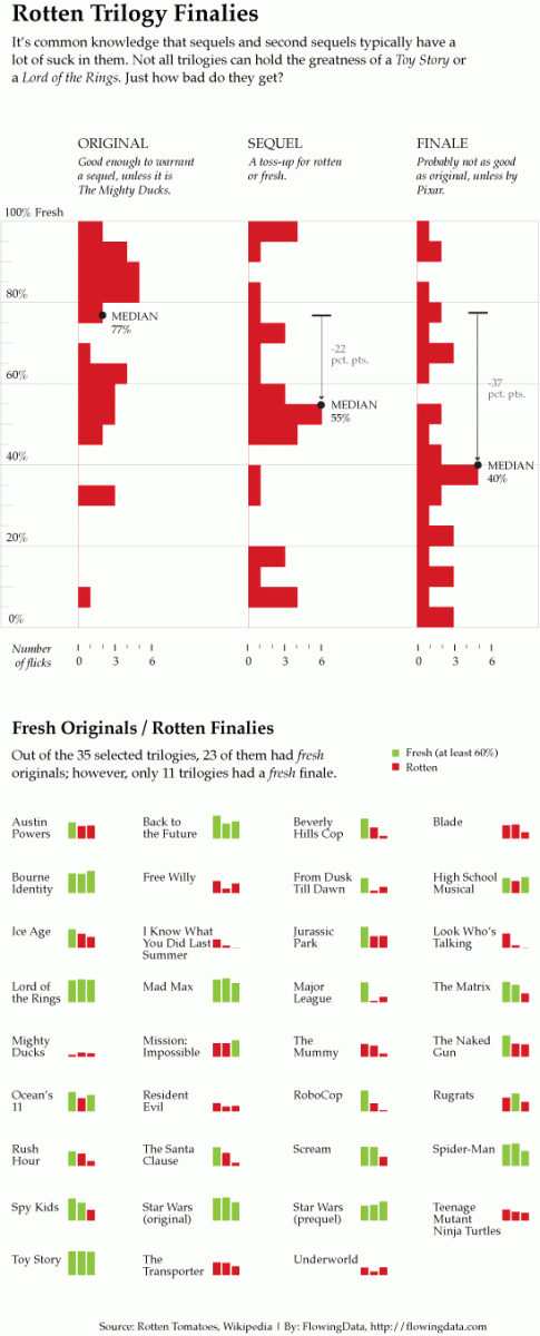
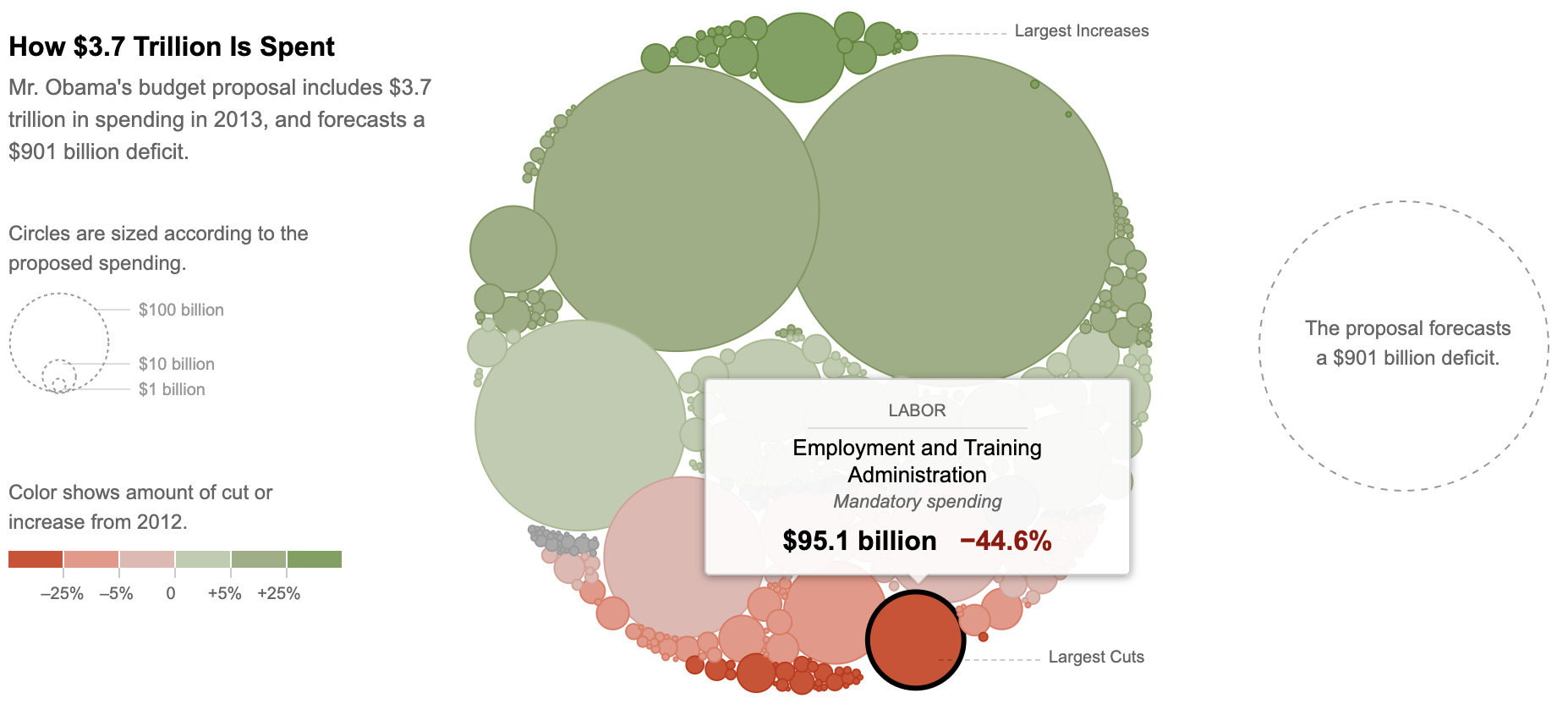
Everyone has a printout of one of the following two visualizations. Take a few minutes to think through the following, and write down notes about what you observe:
- What message is the visualization trying to convey?
- How clearly is this message conveyed? Is it hard or easy to find the information you’re interested in?
- Are aspects that you want to compare placed next to each other to facilitate comparison?
- Does the use of color help or hinder?
- Do labels help give context?
After you examine your visualization, share thoughts with others sitting near you who had a different visualization.
Example 1
Example 2
Data Visualization - Coding
One big emphasis in the course is writing code to create data visualizations.
Let’s get a taste of what this looks like with some examples.
The following visualizations use a dataset on 344 penguins.
- Each row corresponds to one penguin and the columns give information about each penguin.
- 6 rows are shown below.
- For each visualization, make connections between what you see in the visual and parts of the code that you see.
## # A tibble: 6 × 5
##   species   bill_length_mm flipper_length_mm body_mass_g sex
##   <fct>              <dbl>             <int>       <int> <fct>
## 1 Adelie              39.1               181        3750 male
## 2 Adelie              39.5               186        3800 female
## 3 Chinstrap           46.5               192        3500 female
## 4 Chinstrap           50                 196        3900 male
## 5 Gentoo              46.1               211        4500 female
## 6 Gentoo 50 230 5700 maleggplot(penguins, aes(x = species)) +
geom_bar()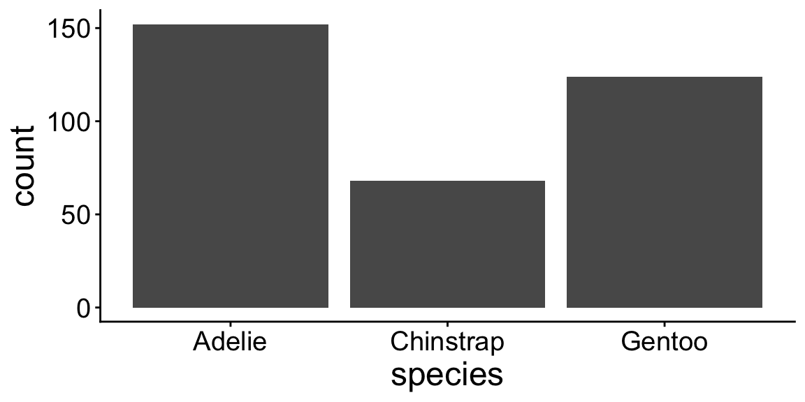
ggplot(penguins, aes(x = species, fill = sex)) +
    geom_bar()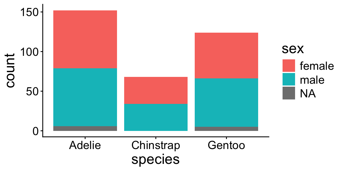
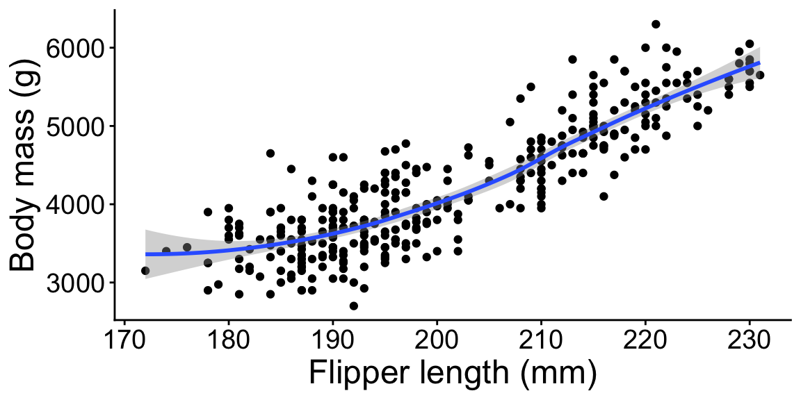
ggplot(penguins, aes(x = flipper_length_mm, y = body_mass_g)) +
    geom_point()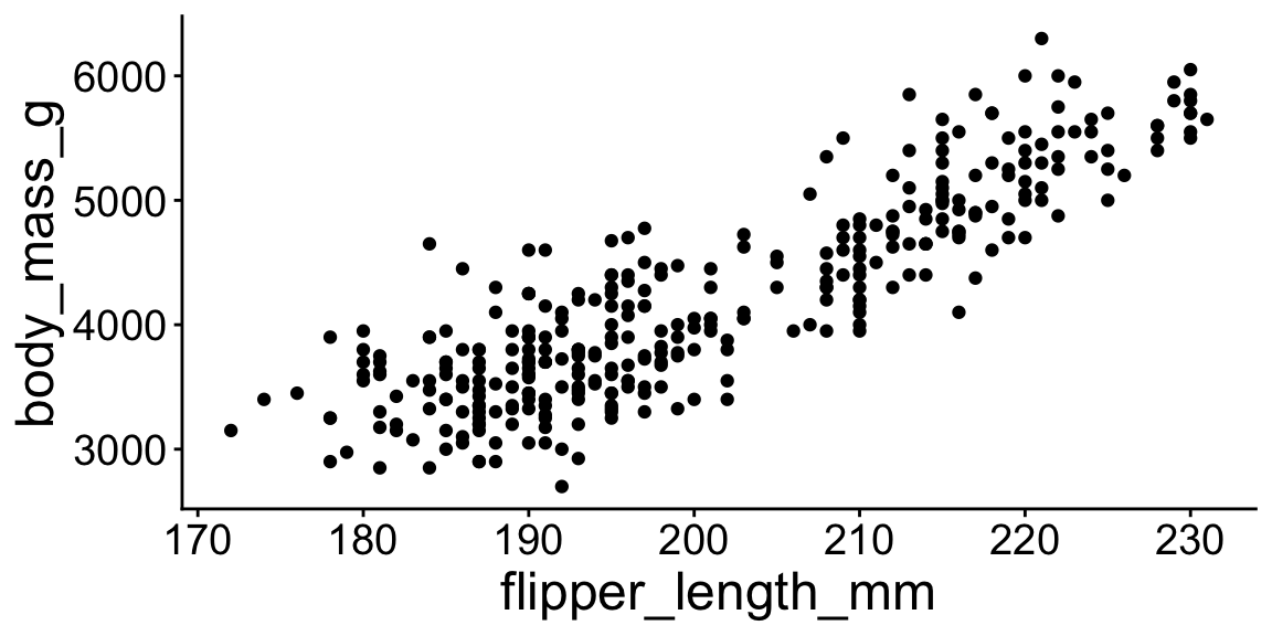
ggplot(penguins, aes(x = flipper_length_mm, y = body_mass_g)) +
    geom_point() +
    geom_smooth()
ggplot(penguins, aes(x = flipper_length_mm, y = body_mass_g)) +
    geom_point() +
    geom_smooth() +
    labs(x = "Flipper length (mm)", y = "Body mass (g)")