library(tidyverse)
library(mosaic)
data(Birthdays)12 Working with character data: Factors
NoteLearning goals
- Understand the difference between
characterandfactorvariables. - Be able to convert a
charactervariable to afactor. - Develop comfort in manipulating the order and values of a factor.
NoteAdditional resources
Read:
- forcats cheat sheet
- Factors book chapter (Wickham & Grolemund)
12.1 Warm-up
Last time: joins and data wrangling
Wrangling and joining are big sources of HIDDEN ERRORS in data science
- Not explicit errors that R gives but SILENT errors that will render our analysis incorrect
Double checking the results of your wrangling and checking in multiple ways is an extremely important part of being a data scientist.
Let’s practice on the Birthdays dataset from Homework 4.
The code chunk below shows 2 different ways to approach Exercise 3a, which asked us to define a new dataset, daily_births, which has the following variables for each date in the study period:
datetotal= total number of births on that dateyear= the corresponding yearweek_day= day of week, labeled “Mon”, “Tue”, etcmonth_day= day of the month (e.g. 1–31)
daily_births1 <- Birthdays |>
    group_by(date) |>
    summarize(total = sum(births)) |>
    mutate(
        year = year(date),
        week_day = wday(date, label = TRUE),
        month_day = mday(date)
    )

dim(daily_births1)
## [1] 7305    5

daily_births2 <- Birthdays |>
    group_by(date, month, day, year) |>
    summarize(total = sum(births)) |>
    mutate(
        week_day = wday(date, label = TRUE),
        month_day = day
    )

dim(daily_births2)
## [1] 7368    7
Why did these give us different results? We might have expected these to give the same results because grouping by date should be the same as grouping by month, date, and year…
Take 5 minutes to collaborate with each other and use the data wrangling tools at your disposal to investigate what might be happening.
Where are we? Data preparation
Thus far, we’ve learned how to:
- do some wrangling:
arrange()our data in a meaningful order- subset the data to only
filter()the rows andselect()the columns of interest mutate()existing variables and define new variablessummarize()various aspects of a variable, both overall and by group (group_by())
- reshape our data to fit the task at hand (
pivot_longer(),pivot_wider()) join()different datasets into one
What next?
In the remaining days of our data preparation unit, we’ll focus on working with special types of “categorical” variables: characters and factors. Variables with these structures often require special tools and considerations.
We’ll focus on two common considerations:
- Regular expressions
When working with character strings, we might want to detect, replace, or extract certain patterns. For example, recall our data oncourses:
##     sessionID dept level    sem enroll     iid
## 1 session1784    M   100 FA1991     22 inst265
## 2 session1785    k   100 FA1991     52 inst458
## 3 session1791    J   100 FA1993     22 inst223
## 4 session1792    J   300 FA1993     20 inst235
## 5 session1794    J   200 FA1993     22 inst234
## 6 session1795    J   200 SP1994     26 inst230
## 'data.frame':    1718 obs. of  6 variables:
##  $ sessionID: chr  "session1784" "session1785" "session1791" "session1792" ...
##  $ dept     : chr  "M" "k" "J" "J" ...
##  $ level    : int  100 100 100 300 200 200 200 100 300 100 ...
##  $ sem      : chr  "FA1991" "FA1991" "FA1993" "FA1993" ...
##  $ enroll   : int  22 52 22 20 22 26 25 38 16 43 ...
##  $ iid      : chr  "inst265" "inst458" "inst223" "inst235" ...
Focusing on just the sem character variable, we might want to…
- change `FA` to `fall_` and `SP` to `spring_`
- keep only courses taught in fall
- split the variable into 2 new variables: `semester` (`FA` or `SP`) and `year`
- Converting characters to factors (and factors to meaningful factors) (today)
When categorical information is stored as a character variable, the categories of interest might not be labeled or ordered in a meaningful way. We can fix that!
EXAMPLE 1
Recall our data on presidential election outcomes in each U.S. county (except those in Alaska):
library(tidyverse)
elections <- read.csv("https://mac-stat.github.io/data/election_2020_county.csv") %>%
  select(state_abbr, historical, county_name, total_votes_20, repub_pct_20, dem_pct_20) %>%
  mutate(dem_support_20 = case_when(
    (repub_pct_20 - dem_pct_20 >= 5) ~ "low",
    (repub_pct_20 - dem_pct_20 <= -5) ~ "high",
    .default = "medium"
  ))

# Check it out
head(elections)
##   state_abbr historical    county_name total_votes_20 repub_pct_20 dem_pct_20
## 1         AL        red Autauga County          27770        71.44      27.02
## 2         AL        red Baldwin County         109679        76.17      22.41
## 3         AL        red Barbour County          10518        53.45      45.79
## 4         AL        red    Bibb County           9595        78.43      20.70
## 5         AL        red  Blount County          27588        89.57       9.57
## 6         AL        red Bullock County           4613        24.84      74.70
##   dem_support_20
## 1            low
## 2            low
## 3            low
## 4            low
## 5            low
## 6           high
Check out the below visual and numerical summaries of dem_support_20:
- low = the Republican won the county by at least 5 percentage points
- medium = the Republican and Democrat votes were within 5 percentage points
- high = the Democrat won the county by at least 5 percentage points
ggplot(elections, aes(x = dem_support_20)) +
  geom_bar()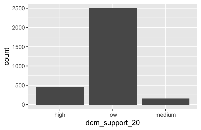
elections %>%
  count(dem_support_20)
##   dem_support_20    n
## 1           high  458
## 2            low 2494
## 3         medium  157
Follow-up:
What don’t you like about these results?
EXAMPLE 2: Creating factor variables with meaningfully ordered levels (fct_relevel)
The above categories of dem_support_20 are listed alphabetically, which isn’t particularly meaningful here. This is because dem_support_20 is a character variable and R thinks of character strings as words, not category labels with any meaningful order (other than alphabetical):
str(elections)
## 'data.frame':    3109 obs. of  7 variables:
##  $ state_abbr    : chr  "AL" "AL" "AL" "AL" ...
##  $ historical    : chr  "red" "red" "red" "red" ...
##  $ county_name   : chr  "Autauga County" "Baldwin County" "Barbour County" "Bibb County" ...
##  $ total_votes_20: int  27770 109679 10518 9595 27588 4613 9488 50983 15284 12301 ...
##  $ repub_pct_20  : num  71.4 76.2 53.5 78.4 89.6 ...
##  $ dem_pct_20    : num  27.02 22.41 45.79 20.7 9.57 ...
##  $ dem_support_20: chr  "low" "low" "low" "low" ...
We can fix this by using fct_relevel() to both:
Store
dem_support_20as a factor variable, the levels of which are recognized as specific levels or categories, not just words.Specify a meaningful order for the levels of the factor variable.
# Notice that the order of the levels is not alphabetical!
elections <- elections %>%
  mutate(dem_support_20 = fct_relevel(dem_support_20, c("low", "medium", "high")))

# Notice the new structure of the dem_support_20 variable
str(elections)
## 'data.frame':    3109 obs. of  7 variables:
##  $ state_abbr    : chr  "AL" "AL" "AL" "AL" ...
##  $ historical    : chr  "red" "red" "red" "red" ...
##  $ county_name   : chr  "Autauga County" "Baldwin County" "Barbour County" "Bibb County" ...
##  $ total_votes_20: int  27770 109679 10518 9595 27588 4613 9488 50983 15284 12301 ...
##  $ repub_pct_20  : num  71.4 76.2 53.5 78.4 89.6 ...
##  $ dem_pct_20    : num  27.02 22.41 45.79 20.7 9.57 ...
##  $ dem_support_20: Factor w/ 3 levels "low","medium",..: 1 1 1 1 1 3 1 1 1 1 ...
# And plot dem_support_20
ggplot(elections, aes(x = dem_support_20)) +
geom_bar()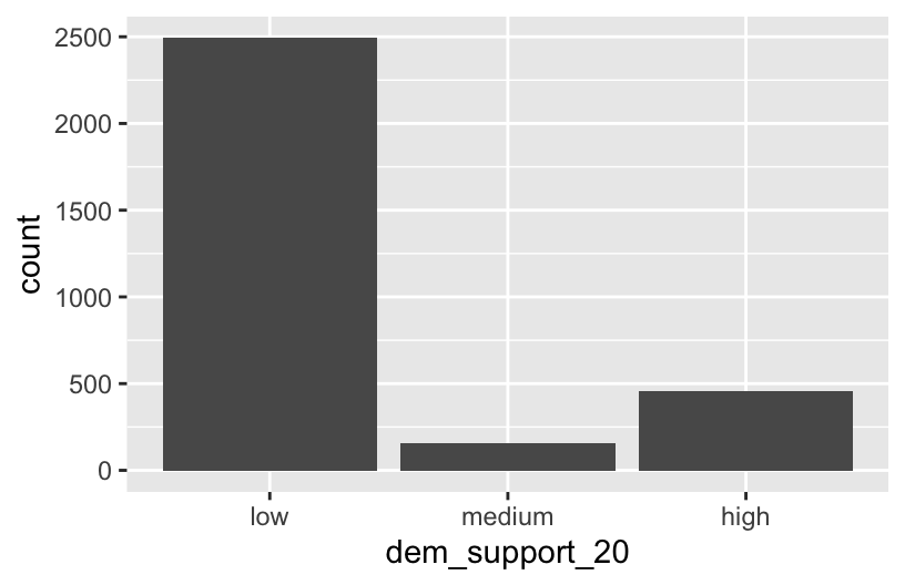
EXAMPLE 3: Changing the labels of the levels in factor variables
We now have a factor variable, dem_support_20, with categories that are ordered in a meaningful way:
elections %>%
  count(dem_support_20)
##   dem_support_20    n
## 1            low 2494
## 2         medium  157
## 3           high  458
But maybe we want to change up the category labels. For demo purposes, let’s create a new factor variable, results_20, that’s the same as dem_support_20 but with different category labels:
# We can redefine any number of the category labels.
# Here we'll relabel all 3 categories:
elections <- elections %>%
  mutate(results_20 = fct_recode(dem_support_20,
                                 "strong republican" = "low",
                                 "close race" = "medium",
                                 "strong democrat" = "high"))

# Check it out
# Note that the new category labels are still in a meaningful,
# not necessarily alphabetical, order!
elections %>%
  count(results_20)
##          results_20    n
## 1 strong republican 2494
## 2        close race  157
## 3   strong democrat  458
EXAMPLE 4: Re-ordering factor levels
Finally, let’s explore how the Republican vote varied from county to county within each state:
# Note that we're just piping the data into ggplot instead of writing
# it as the first argument
elections %>%
  ggplot(aes(x = repub_pct_20, fill = state_abbr)) +
    geom_density(alpha = 0.5)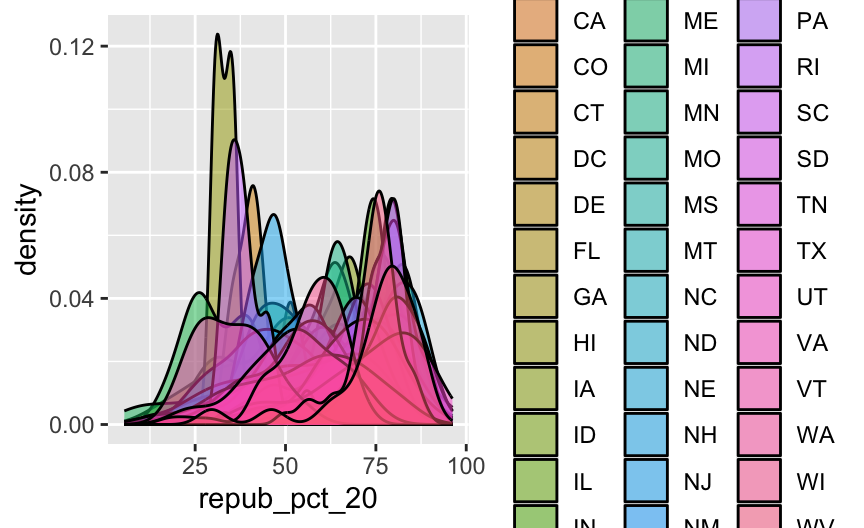
This is too many density plots to put on top of one another. Let’s spread these out while keeping them in the same frame, hence easier to compare, using a joy plot or ridge plot:
library(ggridges)
elections %>%
  ggplot(aes(x = repub_pct_20, y = state_abbr, fill = historical)) +
    geom_density_ridges() +
    scale_fill_manual(values = c("blue", "purple", "red"))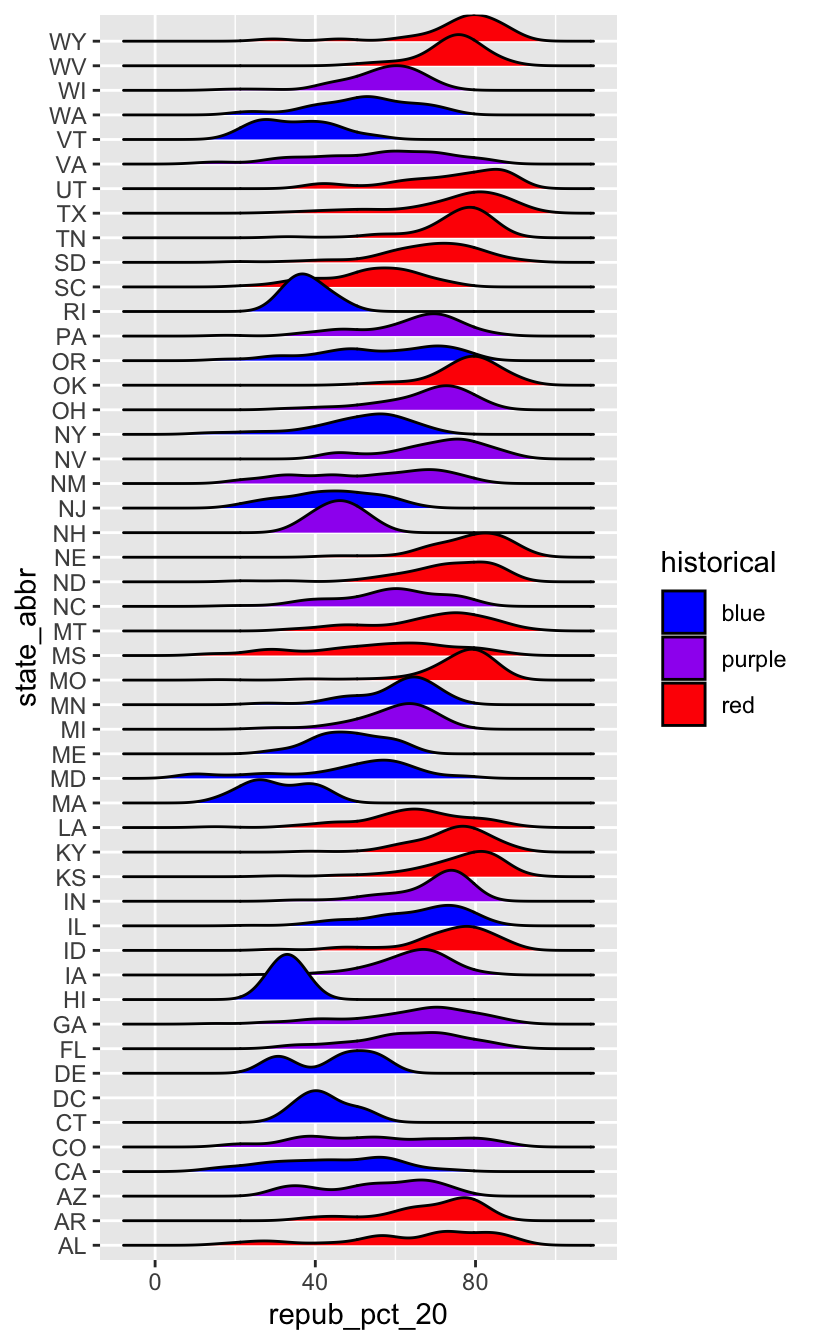
OK, but this is alphabetical. Suppose we want to reorder the states according to their typical Republican support. Recall that we did something similar in Example 2, using fct_relevel() to specify a meaningful order for the dem_support_20 categories:
fct_relevel(dem_support_20, c("low", "medium", "high"))
We could use fct_relevel() to reorder the states here, but what would be the drawbacks?
EXAMPLE 5: Re-ordering factor levels according to another variable
When a meaningful order for the categories of a factor variable can be defined by another variable in our dataset, we can use fct_reorder(). In our joy plot, let’s reorder the states according to their median Republican support:
# Since we might want states to be alphabetical in other parts of our analysis,
# we'll pipe the data into the ggplot without storing it:
elections %>%
  mutate(state_abbr = fct_reorder(state_abbr, repub_pct_20, .fun = "median")) %>%
  ggplot(aes(x = repub_pct_20, y = state_abbr, fill = historical)) +
    geom_density_ridges() +
    scale_fill_manual(values = c("blue", "purple", "red"))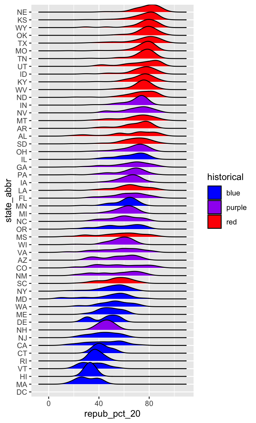
# How did the code change?
# And the corresponding output?
elections %>%
  mutate(state_abbr = fct_reorder(state_abbr, repub_pct_20, .fun = "median", .desc = TRUE)) %>%
  ggplot(aes(x = repub_pct_20, y = state_abbr, fill = historical)) +
    geom_density_ridges() +
    scale_fill_manual(values = c("blue", "purple", "red"))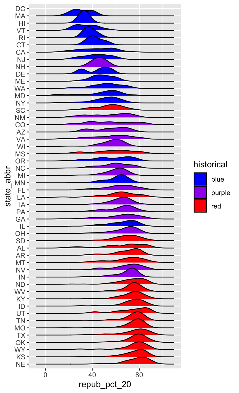
WORKING WITH FACTOR VARIABLES
The forcats package, part of the tidyverse, includes handy functions for working with categorical variables (for + cats):
![]()
Here are just some, some of which we explored above:
- functions for changing the order of factor levels
fct_relevel()= manually reorder levelsfct_reorder()= reorder levels according to values of another variablefct_infreq()= order levels from highest to lowest frequencyfct_rev()= reverse the current order
- functions for changing the labels or values of factor levels
fct_recode()= manually change levelsfct_lump()= group together least common levels
12.2 Exercises
The exercises revisit our grades data:
##      sid grade   sessionID
## 1 S31185    D+ session1784
## 2 S31185    B+ session1785
## 3 S31185    A- session1791
## 4 S31185    B+ session1792
## 5 S31185    B- session1794
## 6 S31185    C+ session1795
We’ll explore the number of times each grade was assigned:
grade_distribution <- grades %>%
  count(grade)

head(grade_distribution)
##   grade    n
## 1     A 1506
## 2    A- 1381
## 3    AU   27
## 4     B  804
## 5    B+ 1003
## 6    B-  330
Exercise 1: Changing the order (option 1)
Check out a column plot of the number of times each grade was assigned during the study period. This is similar to a bar plot, but where we define the height of a bar according to variable in our dataset.
grade_distribution %>%
  ggplot(aes(x = grade, y = n)) +
    geom_col()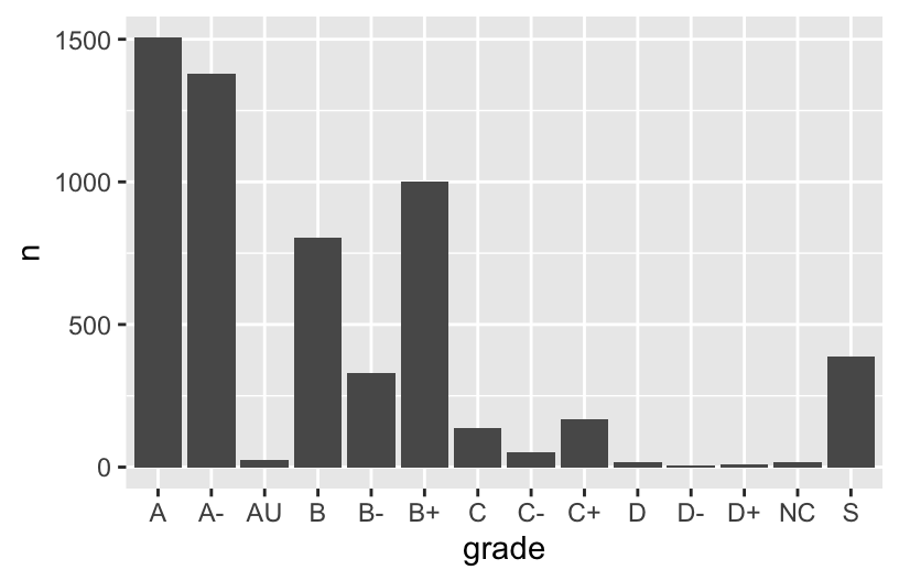
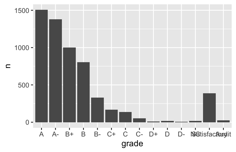
The order of the grades is goofy! Construct a new column plot, manually reordering the grades from high (A) to low (NC) with “S” and “AU” at the end:
# grade_distribution %>%
#   mutate(grade = ___(___, c("A", "A-", "B+", "B", "B-", "C+", "C", "C-", "D+", "D", "D-", "NC", "S", "AU"))) %>%
#   ggplot(aes(x = grade, y = n)) +
#     geom_col()
Construct a new column plot, reordering the grades in ascending frequency (i.e. how often the grades were assigned):
# grade_distribution %>%
#   mutate(grade = ___(___, ___)) %>%
#   ggplot(aes(x = grade, y = n)) +
#     geom_col()
Construct a new column plot, reordering the grades in descending frequency (i.e. how often the grades were assigned):
# grade_distribution %>%
#   mutate(grade = ___(___, ___, ___ = TRUE)) %>%
#   ggplot(aes(x = grade, y = n)) +
#     geom_col()
Exercise 2: Changing factor level labels
It may not be clear what “AU” and “S” stand for. Construct a new column plot that renames these levels “Audit” and “Satisfactory”, while keeping the other grade labels the same and in a meaningful order:
# grade_distribution %>%
#   mutate(grade = ___(___, c("A", "A-", "B+", "B", "B-", "C+", "C", "C-", "D+", "D", "D-", "NC", "S", "AU"))) %>%
#   mutate(grade = ___(___, ___, ___)) %>%  # Multiple pieces go into the last 2 blanks
#   ggplot(aes(x = grade, y = n)) +
#     geom_col()
Up next
Use the remainder of class time to work on Homework!
12.3 Wrap-up
- CP12 (Factors) is due before class on Thursday.
- Homework 5 is due Friday 3/13.
- Quiz 2 is Tuesday 3/31 (the 2nd week we return from break)
- All information is available on the Quiz Information page.
12.4 Solutions
Click for Solutions
EXAMPLE 1
The categories are in alphabetical order, which isn’t meaningful here.
EXAMPLE 4: Re-ordering factor levels
we would have to:
- Calculate the typical Republican support in each state, e.g. using
group_by()andsummarize(). - We’d then have to manually type out a meaningful order for 50 states! That’s a lot of typing and manual bookkeeping.
Exercise 1: Changing the order
grade_distribution %>%
  mutate(grade = fct_relevel(grade, c("A", "A-", "B+", "B", "B-", "C+", "C", "C-", "D+", "D", "D-", "NC", "S", "AU"))) %>%
  ggplot(aes(x = grade, y = n)) +
    geom_col()
grade_distribution %>%
  mutate(grade = fct_reorder(grade, n)) %>%
  ggplot(aes(x = grade, y = n)) +
    geom_col()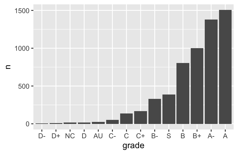
grade_distribution %>%
  mutate(grade = fct_reorder(grade, n, .desc = TRUE)) %>%
  ggplot(aes(x = grade, y = n)) +
    geom_col()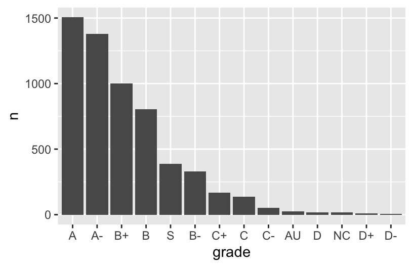
Exercise 2: Changing factor level labels
grade_distribution %>%
  mutate(grade = fct_relevel(grade, c("A", "A-", "B+", "B", "B-", "C+", "C", "C-", "D+", "D", "D-", "NC", "S", "AU"))) %>%
  mutate(grade = fct_recode(grade, "Satisfactory" = "S", "Audit" = "AU")) %>%  # Multiple pieces go into the last 2 blanks
  ggplot(aes(x = grade, y = n)) +
    geom_col()